The first image I chose is from a Vogue magazine cover and features tennis super-star Venus Williams. I looked at the overall image when completing this blog assignment, then I zoomed in on the color scheme, the text, and other graphic design principles. Highlighting symmetry/order text on the magazine cover supports the continuity of the entire image unconsciously; the words “chasing perfection”, lend to the idealism of the image
The words “look, line, attitude” stand out. The picture is initially held together with the gold/brown/tan color scheme. Even the main subject’s skin tone helps to tie in this magazine cover with itself. The hint of white text in the same font as the rest of the filler text helps to maintain continuity within the frame. I really enjoy this magazine cover, and I think it was thoughtfully executed, and professionalism was definitely considered.
The subject looks to be in motion, coming toward the viewer. Again, the text supports the motion of the subject, reading “Game, Set, COCO!” Im not sure if CocoChannel is referenced, but the exclamation in the text as well as the words contribute to the upbeat theme conveyed by the layout. Nothing in this picture is low vibrational or sad. Everything calls on the viewer to smile while gazing at the image. The balance in this image is remarkable: the human form is imperfectly symmetrical in nature, as is the photographer’s choice to capture the subject in the right moment, letting the work of the naturally placed shadows do most of the work. Good eye, no complaints, no changes should not be made.

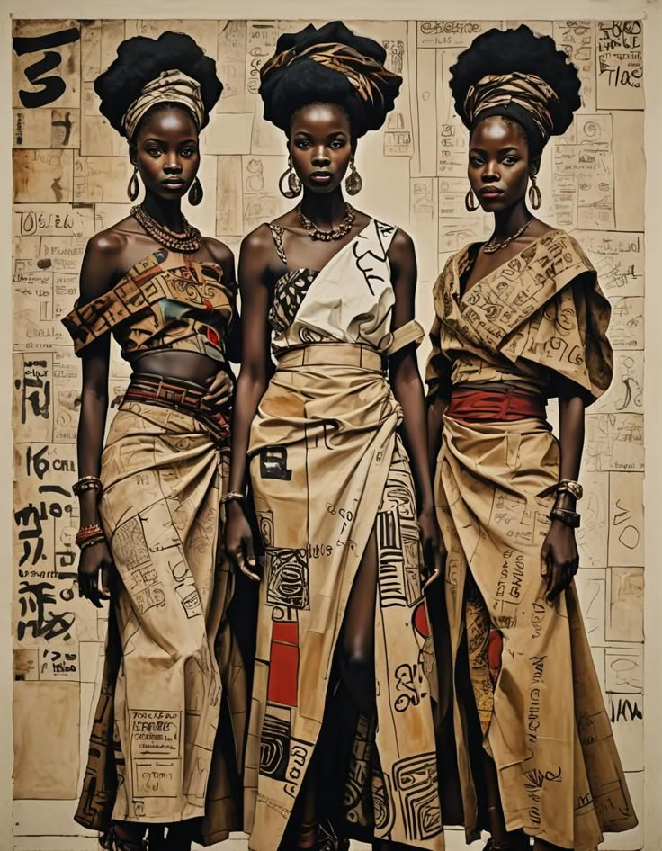
The second image I chose to critique is an illustration; while I initially thought it was a realistic depiction of three women, it is not. But the three women are pulled together primarily by the color, beige, which is seen in the fabric worn by the three women as well as on the walls behind them. Black is the subtle hint that makes the highlights prominent, and the ongoing theme of text behind the subjects as well as on their clothes is a great element. The subtle tones of red bring the three women together and make them look as if they are supposed to be together in the group. The similarity of the petite figures of the three women makes me believe again that the three women are on a similar mission, and their expressions lead to the determination and stoicism of the picture.
The women’s expressions lean to the fact that the women seem secure, and if I could make them speak, they would probably not be saying, “Take me with you; I am at your service,” but instead, “What do you want? This is our collective; we stand strong; nothing will break us.”
The image is very balanced and symmetrical, spreading the correct amount of decorative text throughout the picture. The women share a similar hair-style, the same earrings, the head-wraps are similar, the women are wearing similar jewelry, and their skin tone is a similar brown. Thus the shadows are similar. The text and the very nature of the woman being human, similar to the previous picture, are both very grounding elements within this picture, contributing to the earthly elements within the frame. The only thing that bothers me is the artificiality of the woman in the middle gown and the shadows on her garbs. It is not well drawn and frankly looks like a mistake. I might reconsider this detail. Otherwise, the image is well constructed and well laid out.
Leave a Reply